
Autumn ‘22 Color Palette
It’s about this vibrant early autumn transitional color palette…
Early autumn is so exciting as it brings a late summer harvest of color energy with its call to respond to a new calendar of activity and scene changes. How to adapt this special palette to your interiors. Start with what I call a “fired earth” palette the red color family and consider multiple warm shades together to create power and excitement. Table settings can feature seasonal table linens that present colorful seasonal vegetables and fruits and a variety of accents to welcome warmth and conviviality as gatherings and events come indoors. In walls you can curate your collection by changing the art, starting a new gallery or feature wall in exciting patterns and textures. Blog continues on next page. Read on to see Mood Board recommendations and credits…
It’s about this vibrant early autumn transitional color palette…
Early autumn is so exciting as it brings a late summer harvest of color energy with its call to respond to a new calendar of activity and scene changes. How to adapt this special palette to your interiors. Start with what I call a “fired earth” palette the red color family and consider multiple warm shades together to create power and excitement. Table settings can feature seasonal table linens that present colorful seasonal vegetables and fruits and a variety of accents to welcome warmth and conviviality as gatherings and events come indoors. In walls you can curate your collection by changing the art, starting a new gallery or feature wall in exciting patterns and textures.
Consider the scents of the Fall season starting by a refreshing walk as the leaves begin to fall. In essential oils you can select woodsy scents such a birch, cedarwood, sandalwood and tea tree oil for areas where anti-bacterial properties are required.. They also carry a variety of color signatures to bring healing energy into your living spaces.
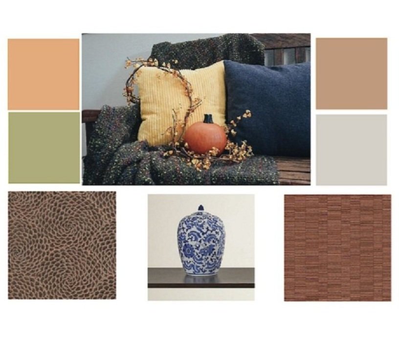
The mood board above includes some paints that reflect the palette of the season and some interesting patterns and textures in wall coverings. Display a porcelain jar that holds warm seasonal spices which will enliven the experience.
On your calendar this season are visits to Fall craft & art fairs with a variety of offerings. In this way you gather items for hearth and home, inspiration for your next DIY project but you will be supporting artisans and the local economy.
I hope your interiors and exteriors support the changing rhythms of this magical season.
Credits: on left from top to bottom Sunbleached Ochre & Ryegrass from Sherwin Williams; Image lower left is from the collection of Karine Sajo - an exotic pattern Chocolate Rose Sand Rose; on the right from top to bottom Metallic Gold and Abalone from Benjamin Moore; Burnt Red Textured Screen from Karine Sajo; Spice Jar is Alcott Hill Pomona available from Wayfair.

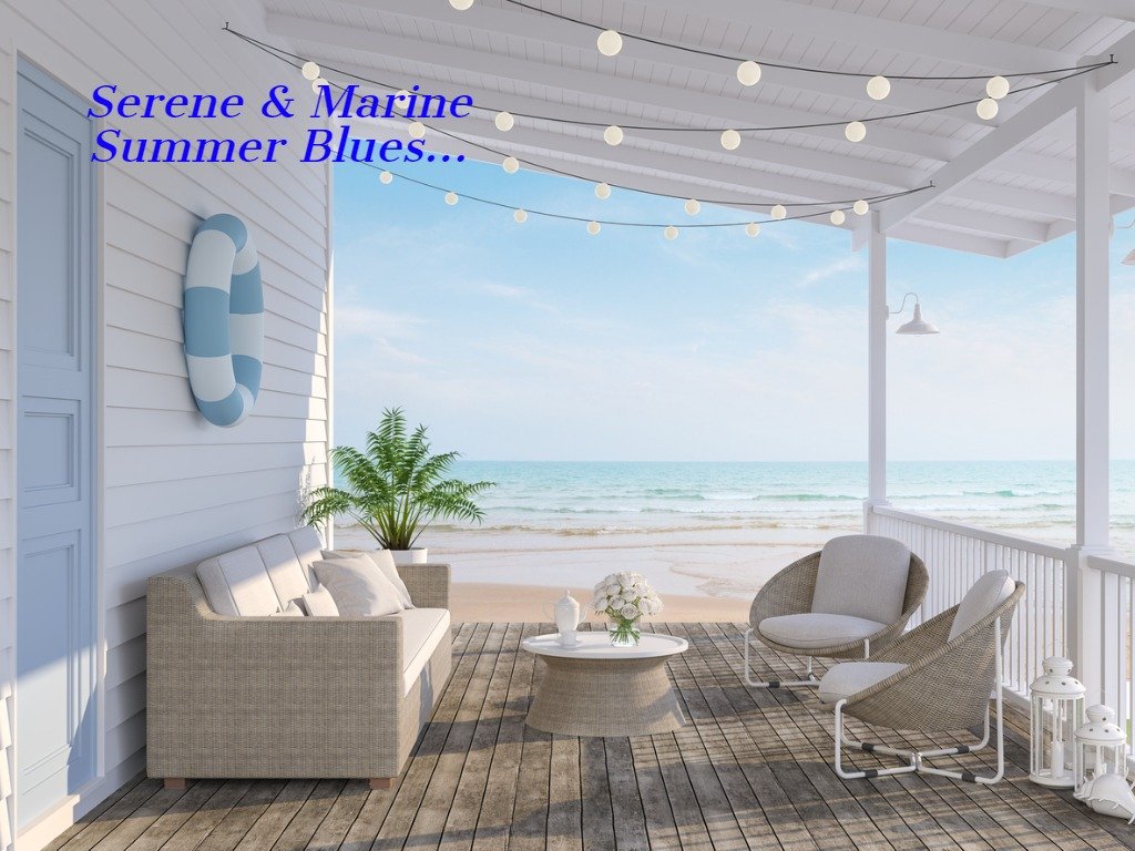
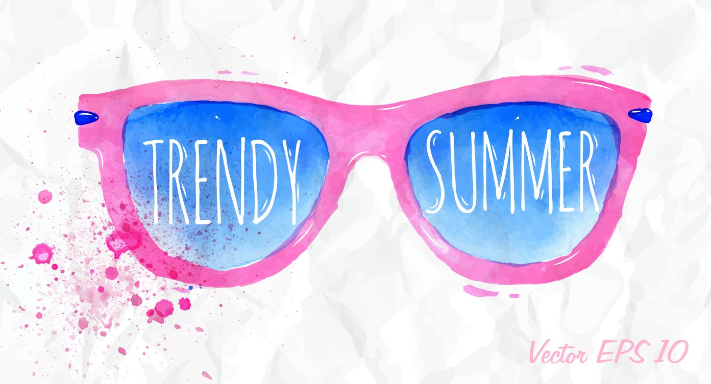
Summer Blues
What does Summer blues mean to you? Do you thrive on the refreshing feel of an ocean of turquoise or a calmer deeper blue for relaxation?
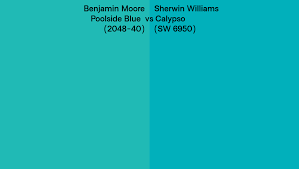
Click on the color chip image in slide show gallery below feature image on next page to see which one you like best. On the left appears Benjamin Moore’s Poolside Blue and on the right Sherwin Williams’ Calypso. *See next page - Read More below
Can you tell which one contains the most green value? Blue is said to be the most universally popular color and as water covers 70% of the planet’s surface it has always been significant. With rising sea levels and the need to protect our oceans we are moving to a study of the Blue Economy. So much can be learned from the sea….where else is blue found - read on…
What does Summer blues mean to you? Do you thrive on the refreshing feel of an ocean of turquoise or a calmer deeper blue for relaxation?
Click on the color chip image in slide show gallery below feature image to see which one you like best. On the left appears Benjamin Moore’s Poolside Blue and on the right Sherwin Williams’ Calypso.
Can you tell which one contains the most green value? Blue is said to be the most universally popular color and as water covers 70% of the planet’s surface it has always been significant. With rising sea levels and the need to protect our oceans we are moving towards the Blue Economy. So much can be learned from studying the sea.
Where else is blue found? From cool blue lavender fields and medicinal plants in a healing garden to color signatures in essential oils which are not “seen” but experienced. Of course the coastal style includes nautical accents such as blue and white striped curtains and chair coverings.
Enjoy your summer blues and in choosing your palette consider whether you want refreshment or calm in your indoor and outdoor spaces.